
Update, circulate
Growing up, my mother used to change our place with very little means but great imagination. Going through random pictures taken in my home, I notice the same tendency.
Most of the things in our home have been with us for a long time and many of them are not stylish or go particularly well together. (I’ve grown to like bad taste because unlike good taste, it has no limits.)
Chairs, cabinets, rugs, textiles, lamps and artworks move around from one room to another. Sometimes there is a common visual thread such as color for how things come together, more often simply some practicality or intuition.
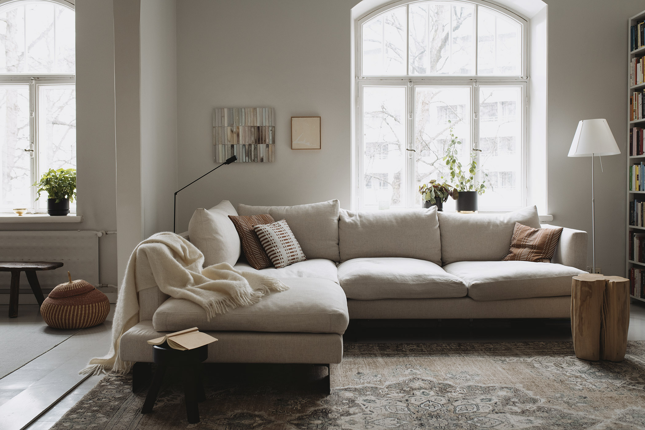
The large oriental carpet first lived in the bedroom, then the kitchen, and now the living room. It’s super durable and sturdy, and our dog uses it as a hairbrush.
In December, I dressed the sofa with sheepskins and cushions with strong contrasting colors such as bright red and black and white. For spring and summer, Johanna Gullichsen’s print cushions in burnt orange feel right.